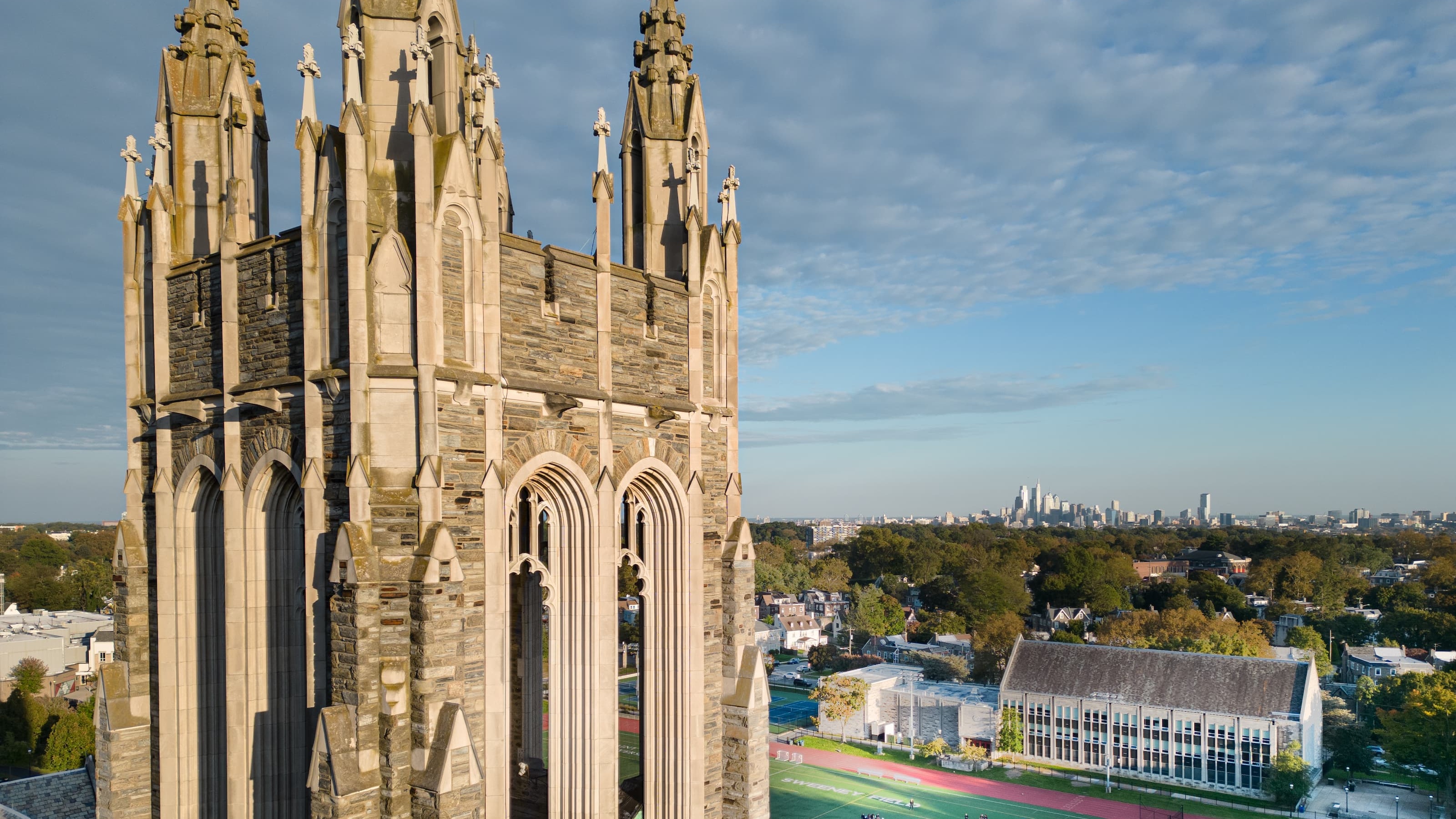
SJU Unveils New Website Focused on User Experience
The University has launched the first phase in a comprehensive redesign of its institutional website, including upgrades to the look and feel, content, and navigational structure of the site.

Saint Joseph’s online presence is getting a makeover.
Today, the University launched the first phase in a comprehensive redesign of its institutional website, sju.edu, including upgrades to the look and feel, content, and navigational structure of the site. The project is a collaborative effort by the Offices of Marketing Communications, Information Technology and Admission, along with many functional areas across campus. The new website offers a first visual and messaging reflection of an institutional rebrand that will follow in 2020.
Users will begin seeing the new site in their browsers this morning; those who do not see it right away may need to refresh their browsers or revisit later in the day.
“A University’s website is one of the top informational tools for prospective students and the virtual face of the institution for those just learning about Saint Joseph’s,” Marie Williams, chief marketing and communications officer, says. “We know that a website is often one of the first ways prospective students go about researching colleges and universities, and user experience is critically important in this process. If students become frustrated with a college website, they will move on to others and maybe even remove that school from their list entirely. It is crucial that we maintain a best-in-market website, and this project puts us there.”
The process, which began in February, included discovery interviews with faculty, staff, students, prospective students, parents and more to determine the biggest needs that each population has when visiting the website.
Through engaging photography, more effective content and rich storytelling, the new site will showcase the best that Saint Joseph’s has to offer, guide visitors to the information they care most about, and encourage them to explore deeper into the site.
Among the highlights of the redesign are a simplified navigation and a new “find your program” tool, which will allow users to search for degree and certificate offerings by name, or by selecting interests or career outcomes and allowing the site to suggest a program or programs. Content on the landing pages for each program was also updated in collaboration with faculty chairs and deans.
The project included upgrades behind the scenes too. The site is now managed through a modern content management system and is hosted in the cloud, improving the site’s overall performance and reliability.
“Moving to the cloud allows the website to operate in a more reliable, secure and highly available environment,” Fran DiSanti, chief information officer, explains. “Server resources can be easily scaled up when usage spikes and improved performance is needed. In addition, the new hosting platform will be less vulnerable to unforeseen events that might cause downtime. Ultimately, users will have a more consistent experience each time they visit the site.”
The first phase of the redesign includes the homepage, school and program pages, a news hub and important enrollment content for prospective students. A second phase to redesign departmental and administrative pages and the alumni site, among others, will begin soon.


