A New Look
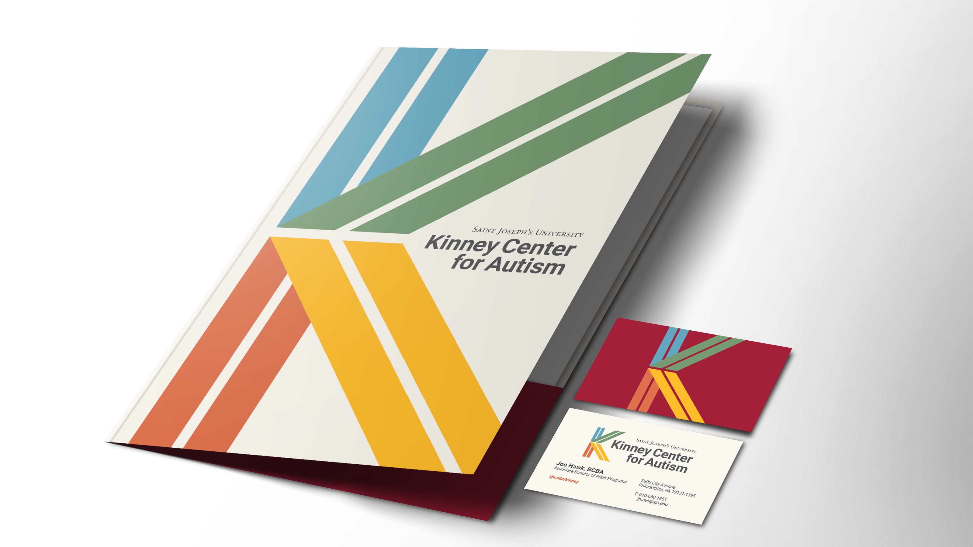
In response to the autism community’s feedback about how ASD is visually represented, the University’s design team developed a new logo for the Kinney Center — just in time for the Center’s 15th anniversary.
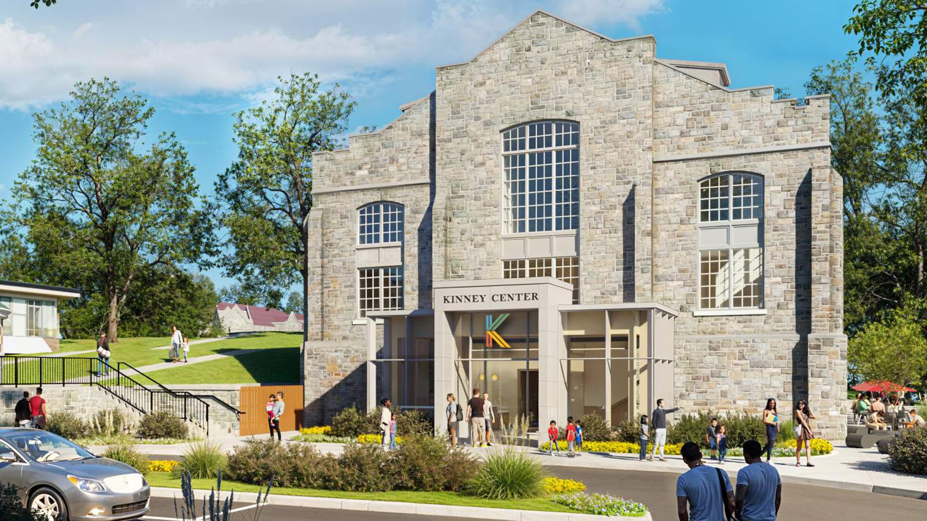
 This is an artist’s rendering. The final design of the building's exterior and interior spaces may vary.
For 60 years, the puzzle piece has been a well recognized symbol of autism — one that’s been part of the Kinney Center logo since its inception. So when the autism community recently began to critique the symbol for framing autism as a problem to be solved rather than celebrated, the University’s design team quickly worked to create a new logo that encapsulates all that Kinney and its community has to offer.
In Their Words
Ryan Starr
Senior Creative Director,
Marketing and Communications
The Kinney Center has a two-fold mission: to educate and train the autism professionals of tomorrow, while supporting and serving the individuals and families affected by autism today.
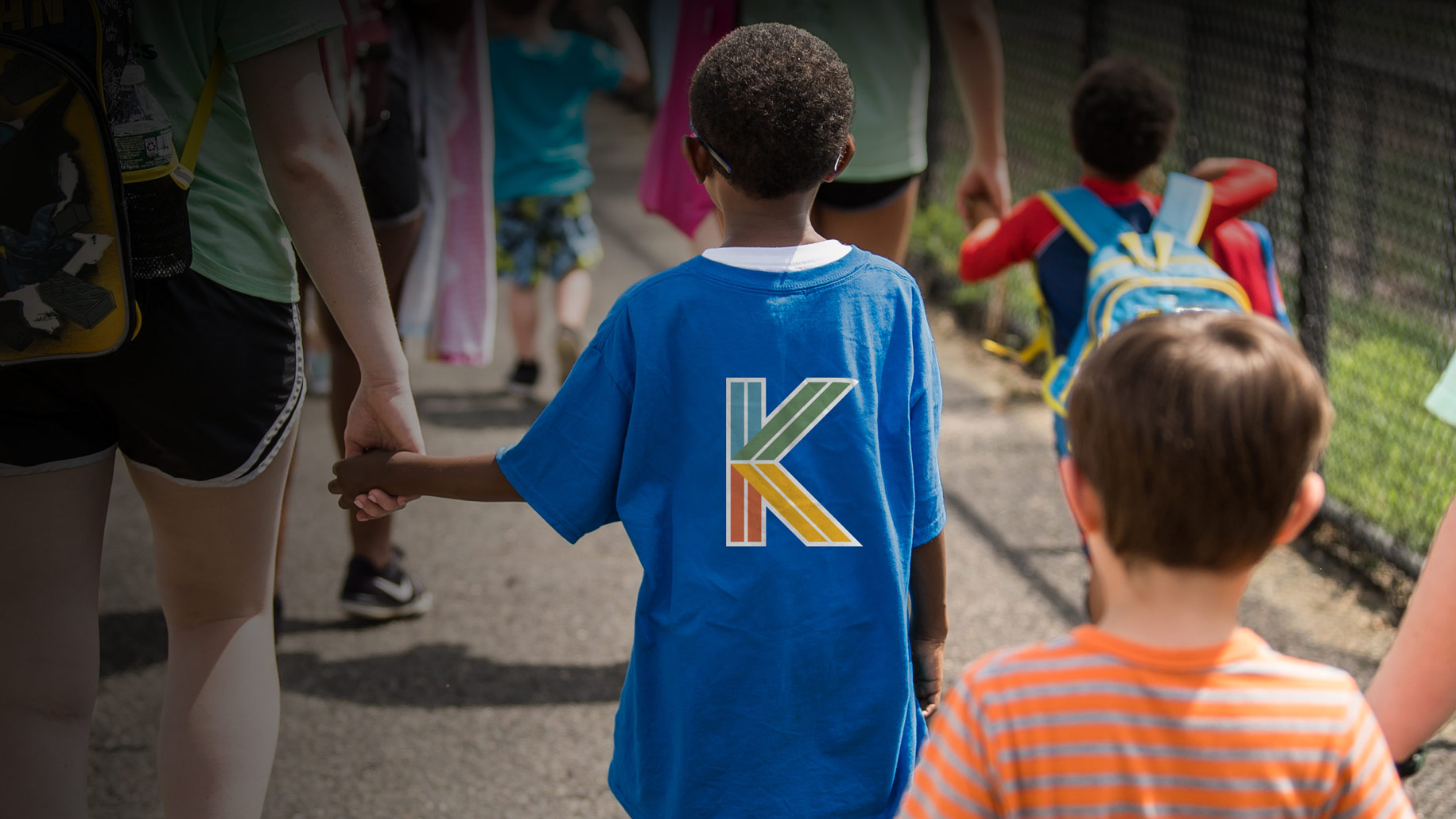
This refreshed logo visually represents Kinney’s mission coming together to form the iconic Kinney K. Within each shape are parallel lines that represent Kinney’s support for its constituents on their entire journey.
The new logo was created with feedback from ASPIRE students, SCHOLARS, Kinney families and University leadership and it is ready to boldly take Kinney through its next 15 years.


