
Alessia Barricelli
The Garden is Dead Now
My best friend inspired me to start working in sculpture. During the pandemic, she inspired me to get out of my comfort zone and turn my playful experiments into jewelry. I work with white polymer bake-to-harden clay then add meticulous details with acrylic paint. Taking pottery classes has given me a better understanding of the processes and light touch needed to create my work. With this body of work, I hope to show the intricate and delicate details of nature through the miniature sculptures and intricate painting of each piece. My pieces will hopefully portray certain life cycles of nature but also growth, decay, and human touch to nature. I am inspired by color in nature and many life cycles of plants show such a variety of color which I intend to incorporate throughout my work. Color also inspires me in nature because of how beautifully, yet also muted or simply colored different living things are. I am also inspired by the way humans affect and treat nature. While some of my pieces are simple in elements I strive for them to show the way humans value and treat delicate forms of life. I also hope to show the lifecycle of certain elements in nature through crochet pieces, using these as a tool for presentation while also carrying the concept of the versatility of Earth. The Earth is versatile in many ways such as shape, form, color, texture, and use of natural materials which is why I am mixing media.
This is important to allow viewers to dive into the world I am creating as if it is real. I want viewers and customers to be able to understand the beauty of nature having scratchy bark yet softer leaves, or neon frogs and dull fruits through my work and use of many art mediums. It's also important for me to create pieces that people can use to express themselves. Which is why I create wearable art using clay, fabrics, and crochet. Currently, the many supporters of my craft inspire me to create new pieces daily. My love for creating grows everyday and the reactions I get from my customers and support system pushes me to try new things and create even more.
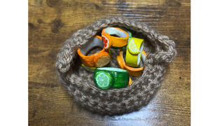


Assorted Citrus Rings in Crochet Fruit Basket, 5” x 4”
Crochet Tree Bark Bowl w/ Floral Rings and Mushroom Earrings, 6” x 6”
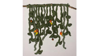
Ivy Wall Decor, 16”x13”, w/ Leaf Chain Earrings and Acorn Earrings
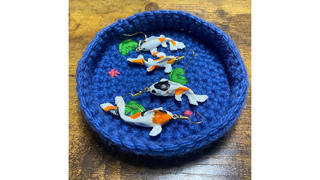
Crochet Koi Pond w/ Koi Fish Earrings, 4” x 4”
Strawberry Earrings w/ Crochet Flower Bloom Coasters, 7” x 7”
Noah Deckert
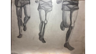
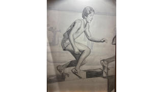
The Art of Running
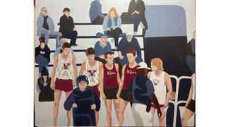
The sport of running is a beautiful thing, which is what I want to convey through my art. I started running back in middle school and ever since then my love for the sport has continued to grow. Not only has it impacted the physical aspects of my life, but the creative aspects as well. While beauty may not be the first thing that comes to someone's mind when they think about running, I hope that through these pieces, I can show that beauty and inspiration flows throughout this sport. Beauty is not always black and white, and sometimes it just takes looking at something from a different angle or point of view. From the training process, to racing, or even immersing yourself in nature through a run, the beauty of distance running is evident. These are just a few things about running that continue to inspire me creatively everyday. As for materials, I chose to work in both acrylic paint and charcoal. Each one is equally as important as the other, as color versus black and white play a crucial role. For the paintings, I use a limited amount of colors, primarily reds and blues, to show emphasis on each different aspect. Although the charcoal drawings lack a color scheme, they make up for it with details and tone that help to tell their story. The cropping of each piece also helps to inform the viewer. Cropping things such as legs allows the viewer to look at running from a different perspective.


Anne Gutherman
Flies from a Long Way Off
I am a storyteller. I have spent the past eight years behind laptop screens and notebook pages, putting word after word, crafting worlds from nothing. I find something magical in the process of translating complex ideas and emotions into a story through which an audience can discover themselves and others. I often spend months sitting with one idea, taking notes, making connections, and examining it from all angles before I even begin to write. Visual art plays a crucial role in this stage for me, and continues throughout the writing process. My notes for my novels are covered in related sketches, which I occasionally develop into full illustrations. Drawing characters, places, and scenes from my novels provides me with a new perspective and allows me to more fully engage with the themes of the story.
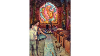
I create my illustrations traditionally, which in some ways acts parallel to my physical notetaking. Each piece is delicately hand-painted in watercolor, built up in dozens of translucent layers with a tiny brush. I often consider working on my illustrations to be an extension of working on my book, in the sense that this particular process invites me to slow down and reflect on the building up of characters and scenes. These illustrations are mostly narrative, capturing a moment, mood, emotion, and interaction in careful detail, much of which will translate into the book.
The novel that is the basis for this series of illustrations is called Flies from a Long Way Off, and it is currently undergoing revision with the intent to pursue traditional publication in the near future. It is a Young Adult fantasy with mystery/thriller elements, and loose inspiration from the Borges Classification of Animals. The story is an exploration of identity, empathy, and belonging. It is, at its heart, an investigation of the human need to categorize both self and others. These themes are therefore a central focus of the corresponding artwork.
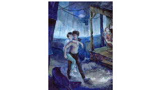
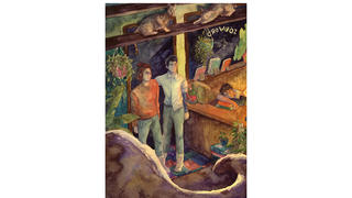
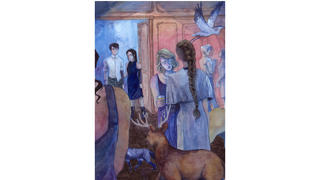
Location, 9” x 12”
They could not understand why anyone would want to escape this.
Page 5
Belief, 9”x12”
Silas didn’t pray, but he closed his eyes and felt G’s presence beside him, and he was thankful in a way that may have been a prayer in and of itself.
Page 55
Responsibility, 9” x 12”
It was almost two by the time that Coley and G returned to the front door of the lamplit Sōðword Booksellers. Silas was waiting for them at the front desk, his skin positively glowing in the warm yellow light, but it seemed he had fallen asleep at some point.
Page 333
Expectation, 9” x 12”
G had always thought that parties were something he wanted to experience. He'd figured in that environment, he’d thrive.
But if this was what a party was... He liked talking to Silas and Coley, but he could just as well be doing that anywhere else. And anywhere else, there would be less people watching, which meant he’d better be able to act how he wanted. If this was supposed to be fun, he was doing something wrong.
Page 402
Paige Jansen
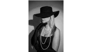
Feminine Mystique
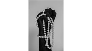
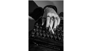
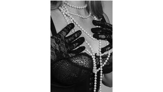
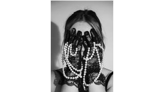
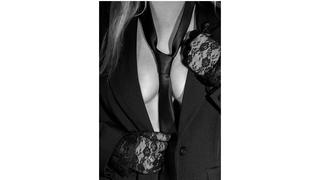
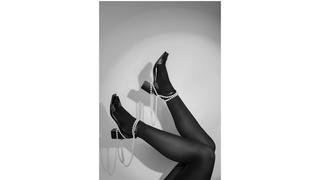
I have always been fascinated by photography’s ability to freeze moments in time and capture and suspend emotions and memories in an image forever. Ever since I received my first DSLR camera when I was about 14-years-old, I have been possessed by the knowledge that cameras bestow upon its user the ability to beat time simply by capturing the world around them into images.
Exploring my interests in vintage fashion accessories and timeless fashion photography, I express how women have a right to their own femininity, sexuality, and bodies. The black-and-white images and the vintage fashion accessories reference a time where all women were often sexualized and seen and treated as objects, especially within the media. The contemporary clothing brings these beliefs into the modern time, showing how many women are still wrongfully seen as inferior and weak, and are also objectified for their bodies and for merely existing as they choose. Women are still often taken advantage of and still often have no control over the way they are represented in the media, within the fashion industry, and in commercial photography.
My project is for the female gaze and is the embodiment of the female gaze, because I am a woman and my models were collaboratively working alongside me throughout the entire process, doing poses they were comfortable with and providing feedback. Photos in the fashion industry are taken primarily by men, and my photos reclaim ownership of the female body, return the power to the female gaze and to raw femininity in various forms, and provide women with a place where they feel heard, seen, safe, and powerful. Women have complete control over their own bodies and are able to show as little or as much as they want and never give anyone the invitation to objectify them or exude power over them just because they are existing the way they want to.
By not being predatory or objectifying, my photos change the narrative of women in the media and in fashion photography, because they represent a freedom of expression, of body, and of self for women. By returning control and voice to all women, I deconstruct vintage beliefs still at play today, both inspiring and in



Dana Pezzuti
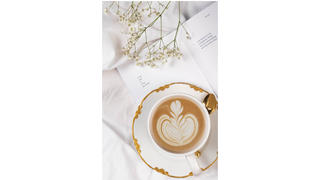
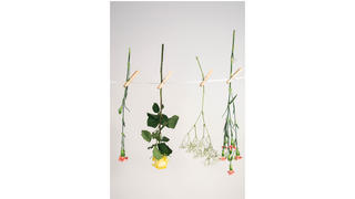
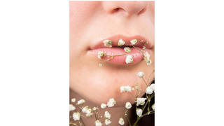
Soft Simplicity
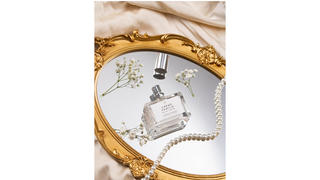
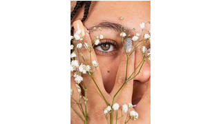
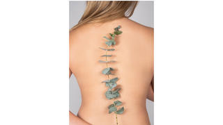
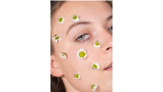
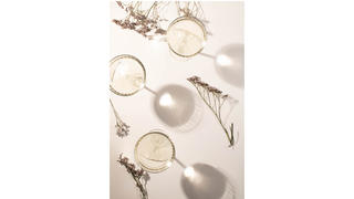
As someone who has struggled with anxiety for the majority of my life, it has often sent me down a path of undervaluing everyday life and not seeing the beauty in the things that surround me. After reaching some low points in the past, I started shifting my view to appreciating the seemingly mundane things, and finding more to be grateful for. Slowly but surely, this new mindset allowed me to find gratitude in my daily life in more ways than one.
This shift in my mindset not only changed my life on a personal level, but also guided me to find my passion for art, where design and photography have become a calm escape for me.
I have since grown to use photography as a method of self-expression; not solely for finding interesting things to capture, but to express my own creativity and get to know myself better through an artistic practice. This has led me to discover my personal photographic style where I am able to use my creative voice to communicate who I am, not only an artist, but as a person.
My goal for this series is to remind everyone that there is always something to appreciate in this life, no matter how small it may seem. In creating this series, it is meant to portray some soft moments where we can find this appreciation and gratitude for the simple beauty that this life has to offer. Using the strategies of combining organic and geometric forms, natural forms in the human figure, and refined domestic scenarios, this series represents some surprising and quiet moments which help to cultivate a sense of mindfulness for the viewer.
It is always easy for us to focus on the negative, but if we can find simple joy in everyday things, we are on the path to a more positive experience.


Ryan Picollo
Revival
Growing up, I’ve always been interested in two things; sports and art. Most of my family were athletes, so I grew up in a household with my dad and brother who played baseball, my mom who ran track, and my sister who played volleyball. On the other hand, my grandmother is a painter so when I would see her every summer growing up, she would introduce me to new ideas and things pertaining to art. I can recall using sports as inspiration for my artwork throughout my childhood. I think the one thing that both art and sports, no matter what sport or art form, have in common is that although someone might have the natural ability to excel in either, it takes a significant amount of time and effort to see progress in both. That is why both are very rewarding, in my opinion.
I’ve decided to use colored pencils and cardboard to create a series of drawings consisting of my favorite athletes of all time, as well as people that inspired me. I wanted to focus on these athletes because I saw them as my idols growing up. I admired their work ethic, style of play and appreciation for the sport they played. About a year ago, by sheer chance, I decided to use cardboard to draw on when I didn’t have any paper to use. I realized that by using cardboard, I was able to achieve the same quality of work as when using paper, whilst also being mindful of what materials I’m using in my art in the spirit of reusing and recycling. Using cardboard is something that I can do forever and for free as it is a plentiful waste product. Anytime I have a package, instead of throwing the cardboard away and buying more paper, I can simply use the cardboard instead of paper and apply another use to the material during its lifespan. On top of its resourcefulness, cardboard can be explored creatively through the corrugation found on the inside. The usage of the corrugation adds texture, as well as other details that cannot be achieved by my drawings alone.
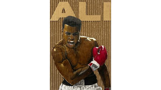
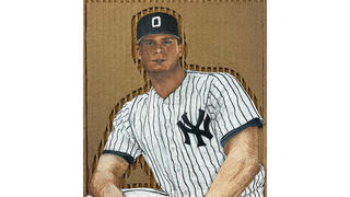

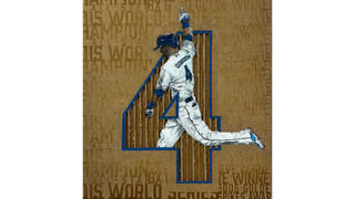

Ali, colored pencil on corrugated cardboard, 10" x 15"
Dad, colored pencil on corrugated cardboard, 10" x 11"
Dawkins, colored pencil on corrugated cardboard, 10" x 15"
Gordon, colored pencil on corrugated cardboard, 10" x 11"
Junior, colored pencil on corrugated cardboard, 10" x 15"
Matthew Sammarone
The Art of Sound
My project contains mockups of album covers that currently exist. With each album cover, I intend to create a specific visual tone that matches up well with the band or musical group at hand. In order to do this to the best of my ability, I will pick five completely different artists and create separate art for each, catering to each artist's musical tone and energy . In general, I want to provide innovative psychedelic and street style patterns in combination with wild-style letterforms and compositions. My choice of patterning is derived from my many influences, including artists such as Stanley Mouse, Michelangelo, and street artists such as Cornbread and Kid Pk. I enjoy creating unique, never before seen pattern styles that pop out to the viewer and are unique in style and composition. This way I will be able to create diversity within each piece of work. My overall goal is to express the tone of the music onto paper in the most efficient and creative way possible.


Damaged, Paint Markers and Sharpie Markers, 20in x 20in
Description:
Damaged by Black Flag, is an album that I had not listened to prior to its re-creation. However, I was always interested in the design of their logo and their overall image as a band. Knowing this, and after listening to a few songs off the album, I chose to go with a very “in your face” type of pattern. I chose to include strange lines that seemed to strike like lightning bolts across the page, with each line flowing into the next in a very disorienting manner. This cover also contains wildstyle graffiti, as I felt that the rough lettering would fit well with the headbanging style of the group.
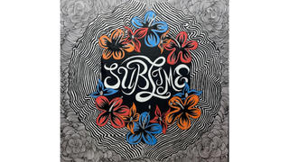
Sublime, Paint Markers and Water Markers, 20in x 20in
Description:
Known for their reggae-inspired punk rock, Sublime relies on their clever lyrics and overall groovy, tropical style to define their sound. For their self-titled album, I decided to create a psychedelic pattern around the borders. I felt that this seemingly three-dimensional pattern represented the band pretty well, as they fit into the psychedelic movement in an interesting and creative fashion. The band’s original cover contains black and white flowers, so I decided to make the bold choice of creating colored tropical flowers for the inner part of the border, to create a nice contrast with the black and white pattern. For the central portion of the cover, I chose to use stringy letterforms to complement the relaxation of the music.
The Color and the Shape, Paint Markers, 20in x 20in
Description:
The Color and the Shape by Foo Fighters, is another album that I have been a fan of for quite some time. Their music contains equally beautiful and interesting lyrics, and is complemented with sharp grunge-like instrumentals. With this cover, I chose a more colorful approach, using a combination of blues, yellows, and reds. To begin, I decided to write the word “Foo” in exaggerated cursive lettering, taking up the entirety of the cover. Following this, I made the decision to overlay this colorful presentation with a bubbly, circular pattern. Using several black circles, I chose to allow the color in the back to contrast the sharp black tones. My finished product contains an interesting bubble pattern that reflects the beauty and simplicity in the lyrics, combined with black outlines to contrast these colorful choices. In general, I wanted the black to represent the sharp chords played throughout the album.
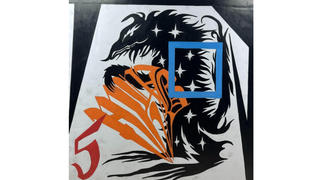
My Beautiful Dark Twisted Fantasy, Paint Markers, 20in x 20in
Description:
My Beautiful Dark Twisted Fantasy by Kanye West is an album that has creatively inspired me to push beyond the limits. Kanye West is known for his ability to musically morph in every album he creates, and Twisted Fantasy is no exception to this. His lyrics are clever and thoughtful, and he combines this with interesting, often wonky instrumentals. With my recreation, I wanted to highlight the beautiful inconsistency that Kanye possesses in this album. The most noticeable part of the piece, appearing on the left side of the cover, is a rat-like beast whose silhouette oversees the entire image; the middle of his body contains a blue square. I decided to include this in order to demonstrate the notion of Kanye breaking out of the box that the public placed him in prior to the release of the album. The number five that appears in the bottom left corner represents this being his fifth album. The beast seems to look upon the number five as if it is praying upon it, demonstrating the world’s view on the artist at that particular point in time.
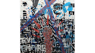
Evil Empire, Paint Markers, Acrylic Paint, Painter’s Tape, 20in x 20in
Description:
Evil Empire by Rage Against the Machine is an album that I have grown very fond of. Their powerful lyrics paired with heavy instrumentals seem to almost overpower the listener. They are loud and proud, and this is depicted in my re-creation of the album. Unlike the other albums in this series, I chose to take a scrapbooking approach. I began by drawing a robotic fist, as this demonstrates the band’s interest in rebellion. Secondly, I wrote “RAGE” in big white blocky letters in order to demonstrate the heaviness of their music. I then created a machine inspired pattern for the background, using black lines and dots of all sizes. Following this, I used painter’s tape to go across the image, then I wrote the name of the band all over the tape in a graffiti style. To make the album complete, I chose to add a fingerpainting style to the piece, as I thought it to be more authentic and would go with the individuality that the band represents.
Kelly Slater
Shaping Existence
In my pottery, I enjoy the process of experimentation. I am constantly immersed in a cycle of creation, exploring the boundaries of my pieces and discovering new outcomes. My inspiration comes from the various stages in the pottery-making process. Each step allows for infinite possibilities to expand on the piece. All of these endless options make ceramics an addicting art form for me.
I shape clay into vessels that play with practicality, perfection, and form. I have learned to love the unpredictable outcomes of my pieces and embrace the beauty of their imperfections. I like to play with forms I have a lot of control over and shape them to where the clay wants to sit naturally. I find myself having a constant conversation with the clay, always making decisions on the clay's shape and color, and changing my original intentions of the piece.
I love giving meaning and purpose to my pieces by evaluating how they relate to each other. What conversations are they having? How do they compliment each other? One of my biggest inspirations in pottery is the open ended nature of interpretation. I could interpret my art one way but it may speak to someone else differently. The beauty of my pottery comes in the conversations it stimulates, as each piece finds its own voice in the different interpretations of individuals who come across it.


